America's Mart - Part II Napa Home & Garden


One of the highlights of my trip to Atlanta was visiting the showroom of one of my favorite companies, Napa Home & Garden.


Napa Home & Garden is owned by Jerry and KC Cunningham. Over the past 10 years they have grown their company exponentially, and in these trying times that is saying a lot!! How did they do it? Well, after meeting KC Cunningham and having the great privilege of spending some time chatting with her, the reasons for their success are crystal clear!


First let me say that I have never met a more gracious and stylish woman. Not only is she chic but KC is also an astute business woman. Her incredible eye and design sense are evident at every turn. Their product line provides high quality solutions for many client's design needs. I have been a fan of Napa Home & Garden for several years, but to say I was even more impressed after I met KC was an understatement. Let me show you why I hold this company is such high regard.


KC mentioned her number one selling items are her Firelites line. What is so wonderful about Firelites are that they use an eco friendly gel fuel made with recycled post-consumer waste from materials that would otherwise end up in our landfills. It also means with almost no fumes they can be used both outside and inside!! Yes inside - of course you need to follow some basic rules, but used appropriately, they really can add so much to your outdoor and indoor decor. Above are the Vintage Pots line - look at the amazing crackle glaze and the colors.


They add an instant ambiance to any space.


Just like a candle, but when not in use they become a wonderful design accessory. I love this style called the Lion Tower - It comes in four finishes - I adore the Matte Black.


But I am equally enamored with the turquoise.


I also really love the shape and finish on the Party Time line. Firelites come in almost 50 styles and also come in larger sizes up to 45" tall, so the possibilities are endless.


I was also smitten with their FibreClay faux lead outdoor planters. The company brochure says "they only look heavy" and that is the truth!!


Both Di and I easily lifted them and marveled at the true life, aged lead finish! Gorgeous!


Of course they also have more traditional planters as well, including the famous Guy Wolff line. The displays at the Mart were just beautiful when all the different lines and statuary were shown collectively.


Isn't this display amazing?


Not just a company for outdoor decor, they also have a stunning preserved greens line. They use a unique, proprietary process so the greens look fresh indefinitely.

They come in many different containers, including these lovely distressed gray pots


And more formal mercury glass containers

The line is varied and includes wreaths as well.
But perhaps the most exciting products I saw were from artist John Lamos. He created the "John Lamos Studio Line" exclusively for Napa Home & Garden.

John's work has become synonymous with sustainablity. He creates his items with a "cementitious" material - cement mixed with two thirds recycled material that yeilds a product that is lighter and stronger than concrete and unlimited in its design appplications.

His current designs, exclusive to Napa Home & Garden, include unique planters, bowls, pedestals, firepots, pavers and chargers. The shapes and forms were all inspired by nature and are made in the USA by hand.
Here are the some photos of the pavers
A close up shows the incredible texture and color that mimics real wood
The color is intergral so even scratches don't show.
Although my flash over exposed this shot - the petal bowls were also lovely

The forms were just so elegant and beautiful


The collection also includes fire burning Torchieres, like the one above, and other items called "Wormwood" plates
It was such a treat to see all the exciting, new things from Napa Home & Garden

And a special thank you, from Di and I, to the wonderful KC Cunningham. We are so thrilled for your company's success and excited to see where you take us next!!


For more information on Napa Home & Garden click HERE. And stay tuned for America's Mart -Part III - Tara Shaw Maison.


(all photos property of Willow Decor and Napa Home & Gardren - not to be used with out permission)

Estoy en proceso..........

.......... de empezar el acolchado.

No sé si son las ganas de que se vaya el frío y llegue la primavera .......pero estas flores aplicadas en uno de los miniquilts que aparecen en el libro Remembering Adelia, fue otro de los fichajes que empecé enseguida. Según nos cuenta Kathleen , su autora, estas flores están hechas de fruces porque se inspiran en los que las mujeres llevaban en sus vestidos en la época de la guerra civil americana. Las puntillas eran caras y un buen frunce de tela o cinta podía suplir el efecto , no tan " lujoso " pero sí vistoso. Por eso estas flores dobles están hechas de frunces que luego quedan disimulados tras un buen botón.

Es un mini quilt para colgar que lleva aplicación, el único del libro. Lo voy a acolchar a mano porque creo que es lo que luce más en este tipo de quilts.

Las telas son algunas compradas , algunas reaprovechadas.


El caso es que una vez que la base estuvo montada , empecé a aplicar la rama central con cuidado de tener las otras metidas debajo.......


Y así fue creciendo esta plantita...........Primero las ramas........

Reducí la medida que propone para hacer los tallos porque los he formado con la ayuda de uno de esos apartitos de Clover para hacer bieses, y no a mano como dice la autora. No tienes que estar rompiéndote la cabeza en que te salgan perfectos, sólo hay que meter la medida adecuada por la parte más ancha , empujar con un alfiler por la ranura superior y dejar que salga un poquito ..... luego sólo es cuestión de ir estirando el aparatejo e ir planchado por el otro según va saliendo la tela , ya dobladita hacia adentro , claro. Así que en un pis pás te puedes montar bieses para aplicaciones de este tipo. Supongo que la mayoría ya lo conoce pero como sé que también pasa gente por aquí que está empezando en el tema del patchwork , le vendrá bien saber que existen estas cosas...........


Y como una imagen vale más que mil palabras , consulta este vídeo y te lo dejará aún más claro.


............... Luego llegó el momento de añadir las flores y las hojas.


.......Hasta conseguir tener un buen ramillete de flores........ que ya va perfumando mi habitación ......... ¿ cuál crees que será su olor ?


Dreaming of Spring

I woke up to a temperature of 6 degrees this morning. That's -14 to those of you on the Celsius scale.  I am so tired of pulling on tights and boots and twelve layers everyday.  In fact, I think I'd like to burn all my winter clothes.  Spring is still two months away and I'm already dreaming about what I'll be wearing. I love all these full skirts, fun dresses, bright colors, and most of all, the bare legs.  I can guarantee I'll be twirling too when the warm weather finally arrives!


Photos by Tommy Ton, Vanessa Jackman and The Sartorialist

A beautiful Belgian farm house

I love to tell and to show you a lot about Belgian architecture and interior design, so that you all become more and more familiar with it, my dear readers!

Today I am talking about a Belgian farm house, that is one of my all times favorites.

The house is new built but thanks to all the reclaimed materials, the owners brought in, it looks aged and very authentic!

Ingrid Segers and Annemie Coppens, the owners of the building company Porte Bonheur, and even the owners of this house, together with the decorator Natalie Haegeman, have done a wonderful job.
 

1

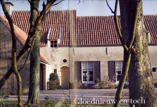
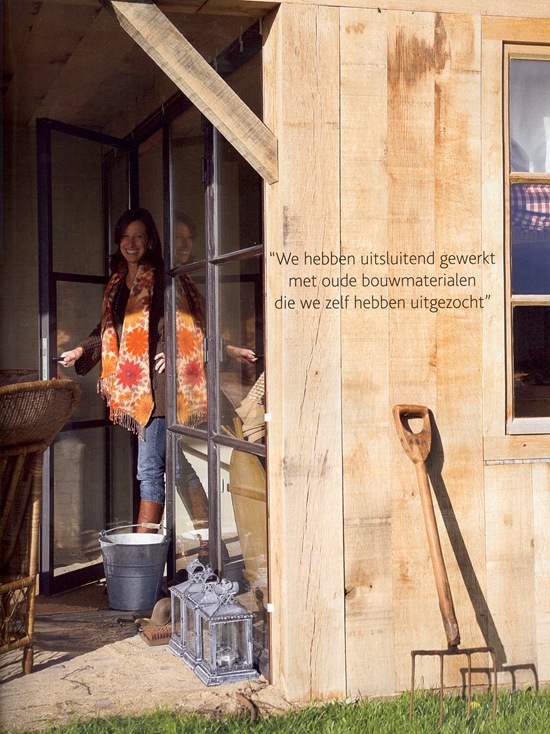
The house has a limed façade and the home extension is built with reclaimed oak.

Reclaimed Belgian roof tiles, which we call here  “Boomse pannen”.
 

2

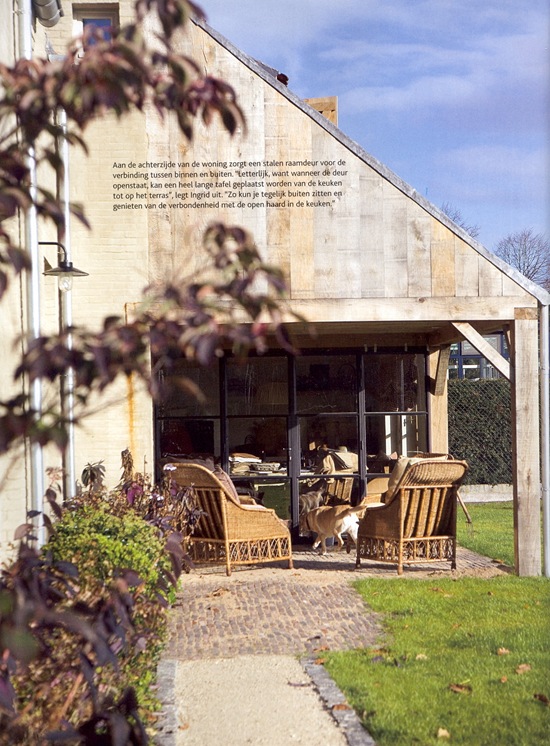
The use of steel windows and doors are one of the characteristics of Belgian architecture. I wrote about this HERE.
3

The oak wood home extension.


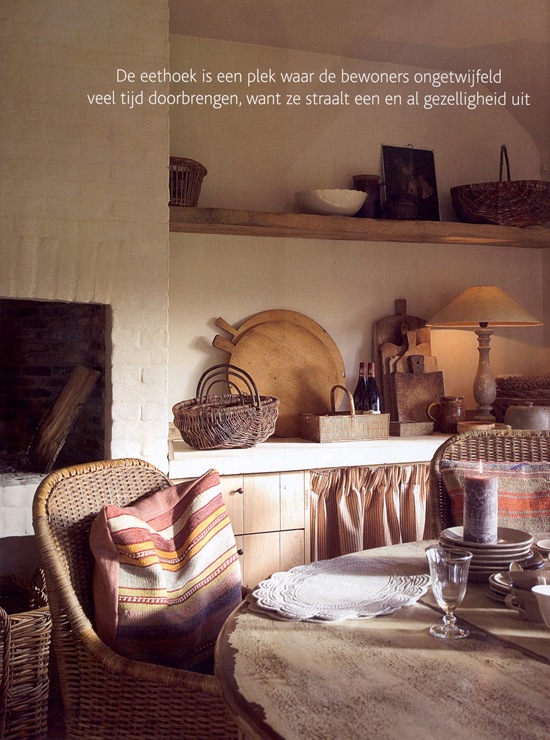
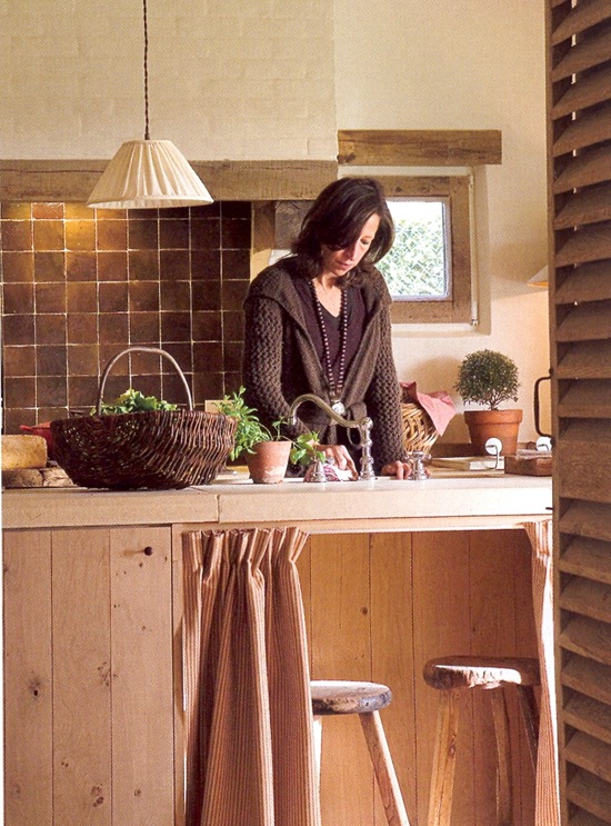
4 The kitchen dinner corner.

Even the interior of the house has an aged appearance because of the antique and aged furniture the owners and decorator have chosen for. I love it!
 

5

The architectural plans of the house were designed to match the old doors which the owners bought long ago before the house was built. So as you can see above, the door between the living room and the kitchen is an old stable door.

Morrocan zelliges wall tiles in the kitchen.
 

6

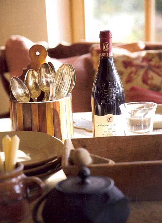
Love this still, so inviting!


7

Even the exterior as the interior of this house are so charming and cozy, which creates such a familiar atmosphere!

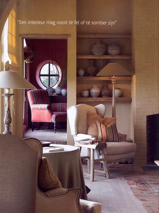
Notice the beautiful pottery on the shelves.
 

8

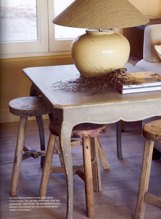
Natalie Haegeman, a decorator of Antwerp, ( I wrote a blogpost of Natalie earlier (HERE) ), was asked to create a warm and inviting interior! She did it in an outstanding way, by choosing beautiful aged furniture, carpets and fabrics!

Natalie is also specialized in custom made lampshades. Her website of these remarkable shades will soon be on line HERE. So she took care of the sconces, the floor and table lamps. Sometimes she used old pots that she transformed into beautiful table lamps as the one here on the picture above.

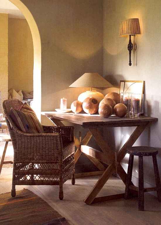
Remarkable are the aged stools, placed around in this house. Very practical if all your friends are coming over!
 

9

Beautiful combination of the oak table and wicker chair.

Aged oak boards used as flooring.
 

10

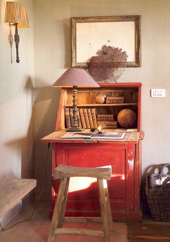
“Although the chosen colors for the interior are held rather subdued, this antique secretary is an eye catcher.” explains Natalie. “It is an antique piece of furniture that is crooked, but it has the perfect look for this house.”

Notice the sconce with one of Natalie’s custom made shades.
 

11

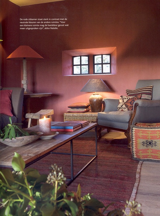
The red painted sitting corner is in contrast with the neutral tones of the other lime painted rooms. But according to Natalie, a more smaller room as this one, is allowed to have a more pronounced color.
 

12

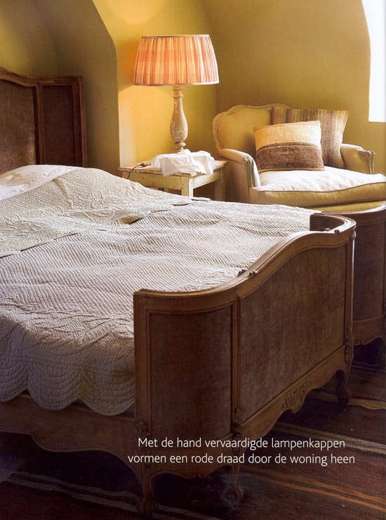
Antique bed.

Notice Natalie’s bedlamp.
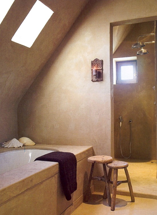
 

13

The applied tadelakt technique gives the bathroom a rural and natural look.
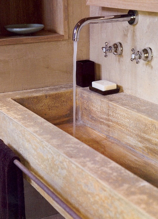
 

14

Well-meant congratulations to Ingrid, Annemie and Natalie with their gorgeous, successful project, which is a wonderful example of the Belgian rural architectural design.


I hope you enjoyed this farm house tour of today and I wish you all a wonderful week!

xx

Signature


Architectural design by Porte Bonheur 

Interior design by Natalie Haegeman

Images scanned  Belgian magazine Wonen Landelijke Stijl – oktober-november 2008

Photo credit : Bieke Claessens